
Results of the comparison in terms of the metrics given in the metrics post.
Right click to open plots in a new window to see better
Victor Purpura
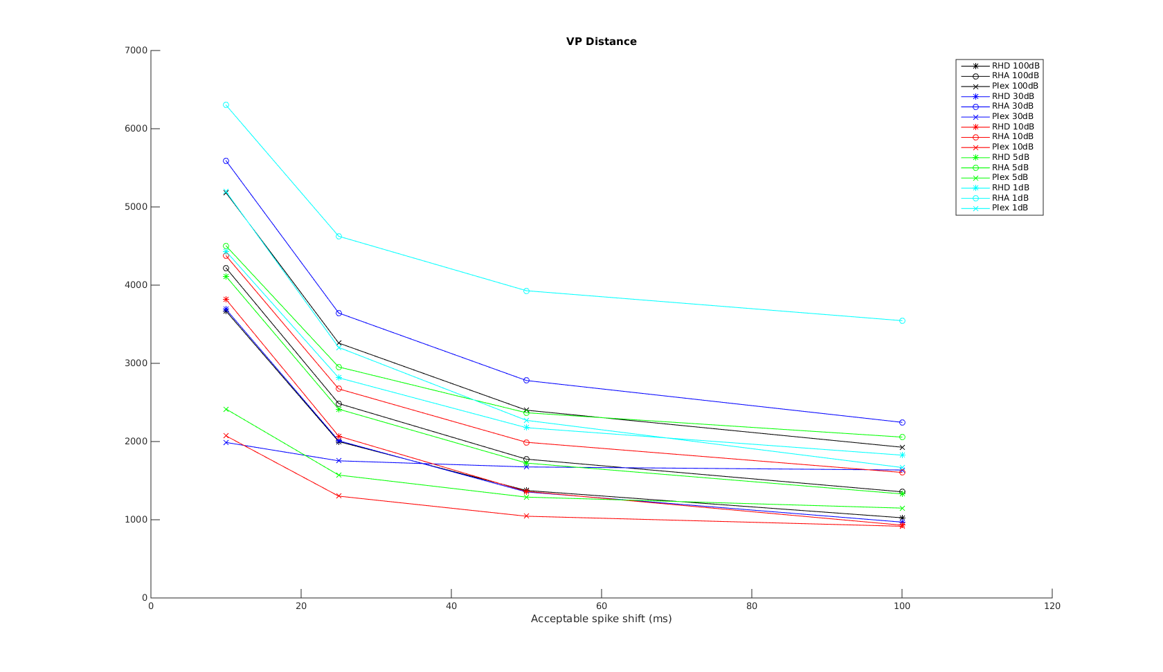
In this plot, the x-axis is the acceptable time shift we can shift a spike in the recording to match one in the reference, and equal to \(1/q\), where \(q\) is the shift-cost in the original VP formulation.
When the acceptable time shift is small, VP is a measure of the number of non-coincident spikes. When the shift is large, it is more a measure of difference in spike counts.
As expected, the performance is much worse when SNR is low. As expected, Plexon performs well on the VP metric across all timescales. RHD has very close performance, except in the 10ms scale. This is most likely due to the onboard spike-sorting uses only 0.5ms window rather than the full 1ms window used in Plexon, resulting in missed spikes or shifted spike times. I expect the difference between plexon and RHD to decrease with shorter spike duration/features.
RHA has the worst performance, and this is especially apparent for low SNR recordings. The difference of the performance difference between RHA and RHD is most likely RHA’s use of AGC. When SNR is low, AGC also amplifies the noise level - therefore a burst in noise may result in amplitude similar to a spike. This is also apparent when trying to align the RHA and reference waveforms prior to metric comparison - with simple peakfinding it is impossible to align the signals properly when SNR=1dB. More advanced frequency-domain techniques may be needed. Therefore, the cyan RHA curve should be counted as an outlier.
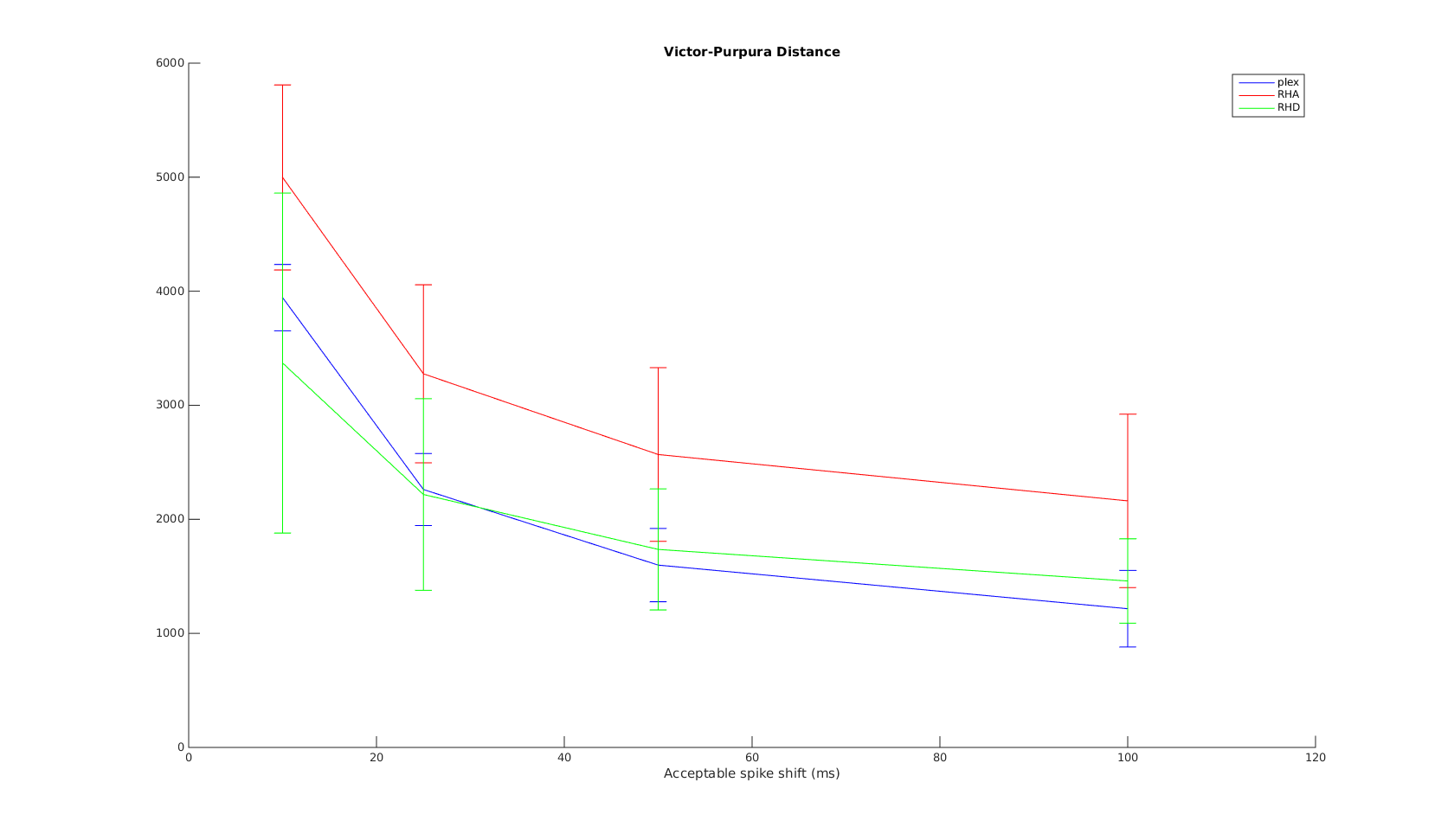
The mean and standard deviation plot confirms the above. At time scales greater than 10ms, plexon and RHD have very close performance over different SNRs.
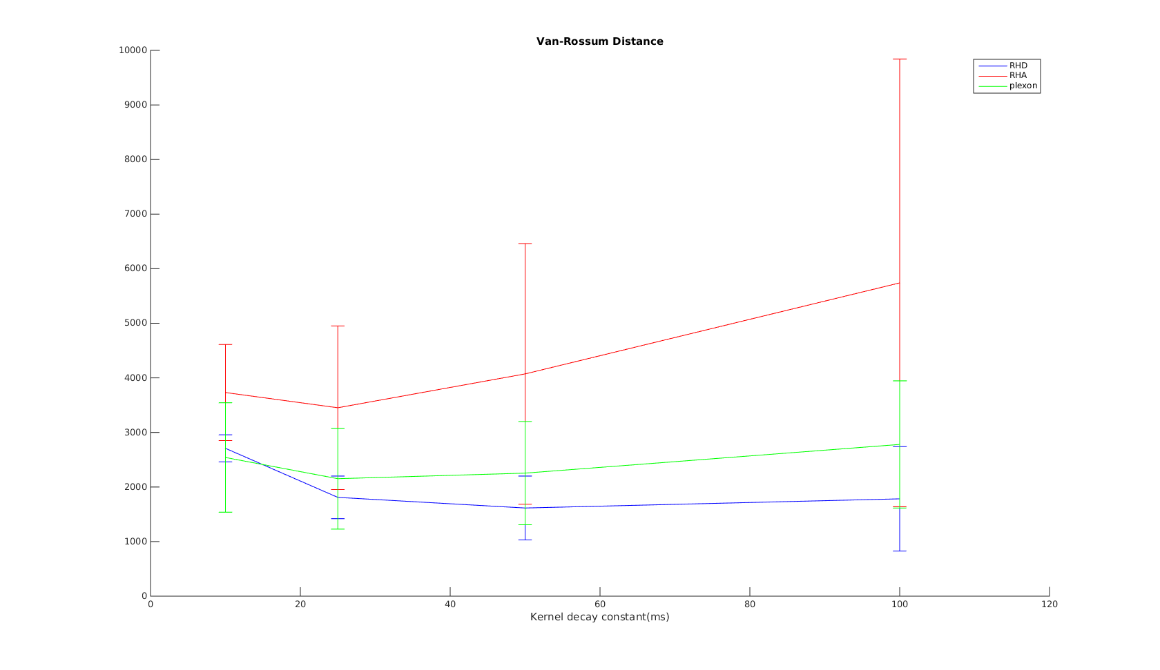
van Rossum
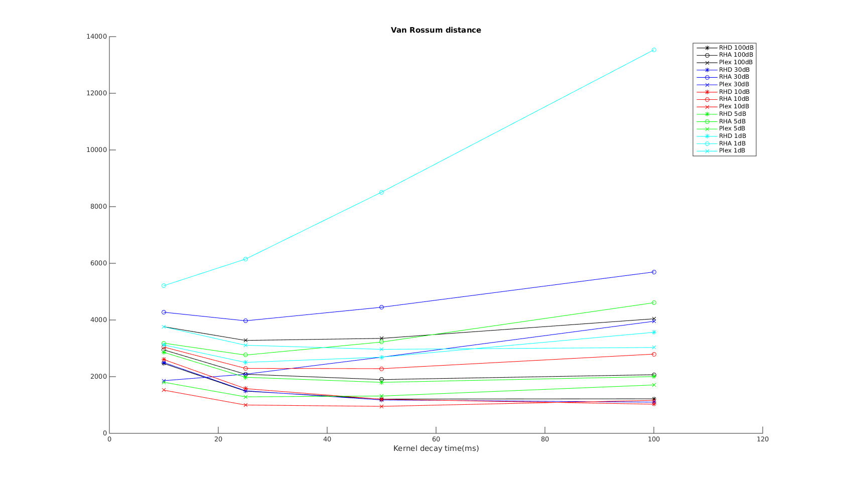
The x-axis is the \(\tau\) parameter used in the exponential kernel. As \(\tau\) increases, the metric is supposed to measure non-coincident spikes to difference in spike counts and firing rate.
I would expect the curves to show the same trend as that in the VP distance. But instead it shows the opposite trend. Further, the results don’t agree with the other tests…therefore I must conclude even the corrected Paiva formula is incorrect..?
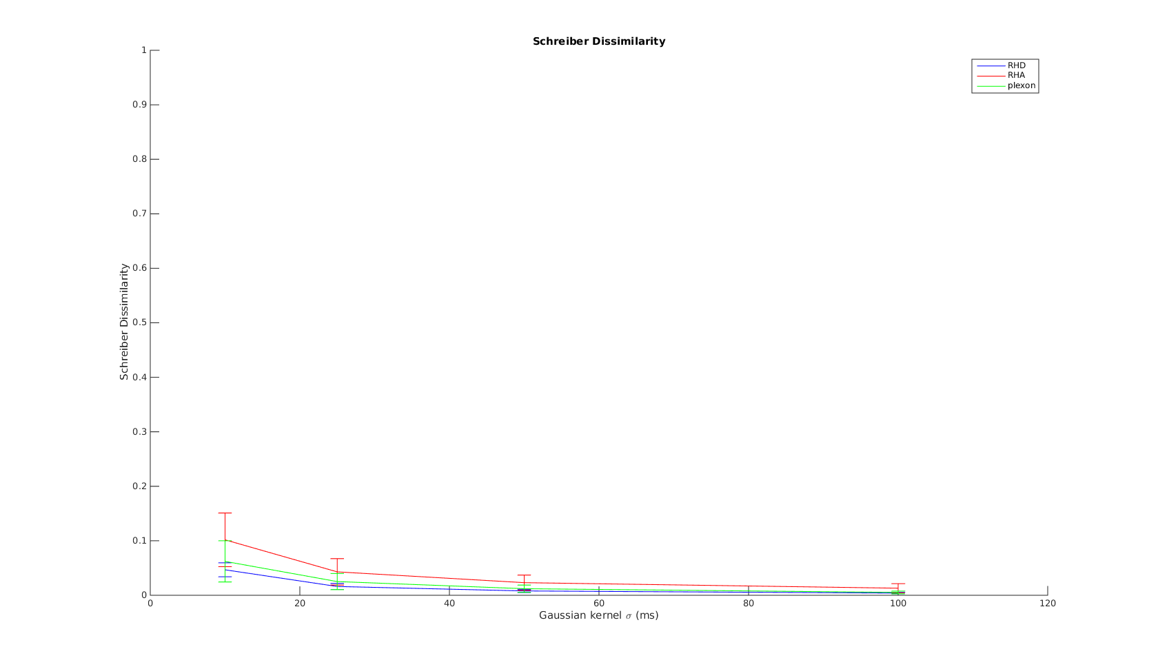
Schreiber
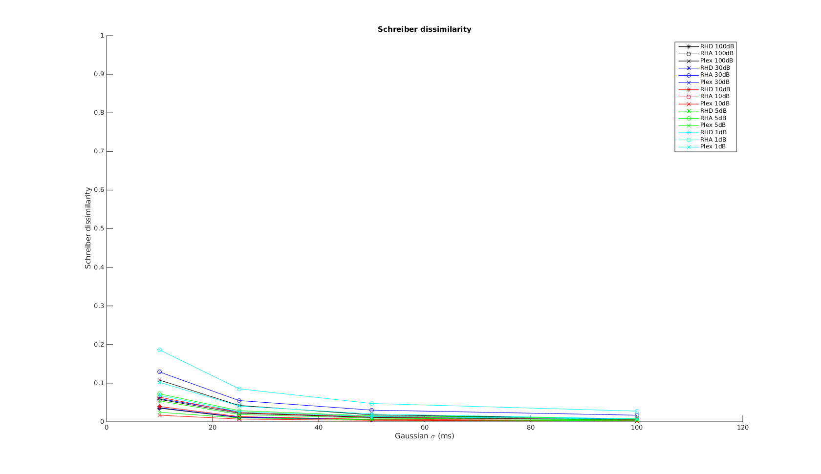
The x-axis is the \(\sigma\) parameter used in the Gaussian kernel. As \(\sigma\) increases, the metric measures the non-coincident spikes to difference in spike counts and firing rates. The curves show the expected shape. And again, at time scale greater than 10ms, all three systems have simlar performance.
Binned Distance
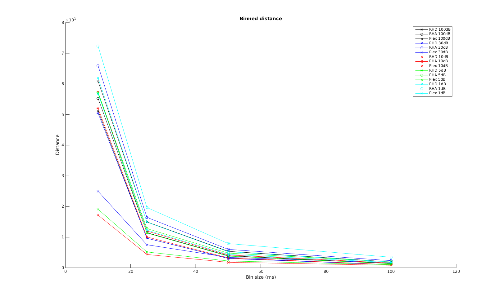
The x-axis is the bin size used in calculating the binned distance. The order of the curves are almost the same as that in the VP-distance. Again, Plexon performs the best for small time scale, all three systems converge in performrance with increasing bin size.
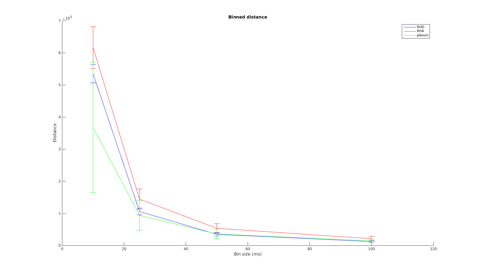
The mean curve shows the convergence for binned distance is a lot steeper than that for VP-distance. This is really good news, as most of our decoding algorithms use binned firing rates. It shows for bin size \(>=25ms\), the wireless systems have performarnce very close to Plexon.
Finally, the order of performrance is again \(plexon>RHD>RHA\).